Guide: Templates
Each template describes a type of “form” your users will complete using the mobilit.ee mobile app.
Creating a template
To create a new template, click on the button that looks like this:
Each template is known by a unique name, containing letters and numbers and starting with a letter. Any characters that are not allowed will be changed or removed. You can’t change this name later.
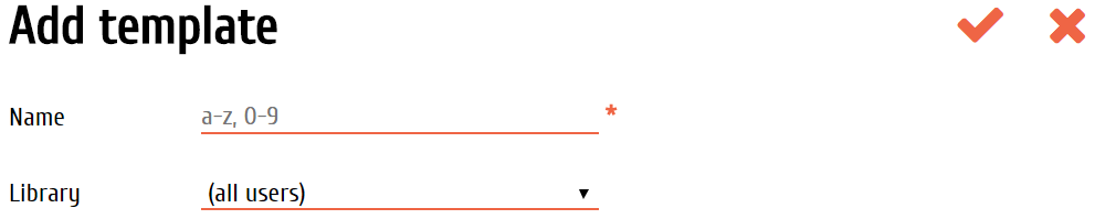
Templates are stored in “libraries”. You can control which libraries each user can see. Everyone sees templates in the “(all users)” library.
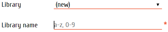
If you’re happy for all your users to see your new template, then just leave “(all users)” selected. Otherwise, choose another library, or choose “(new)” to create a new one. A new library needs a name too, just like the template. If you create a new library, don’t forget to give users access to it.
The Template Builder
Use the Builder to realize your ideas.
Imagine…
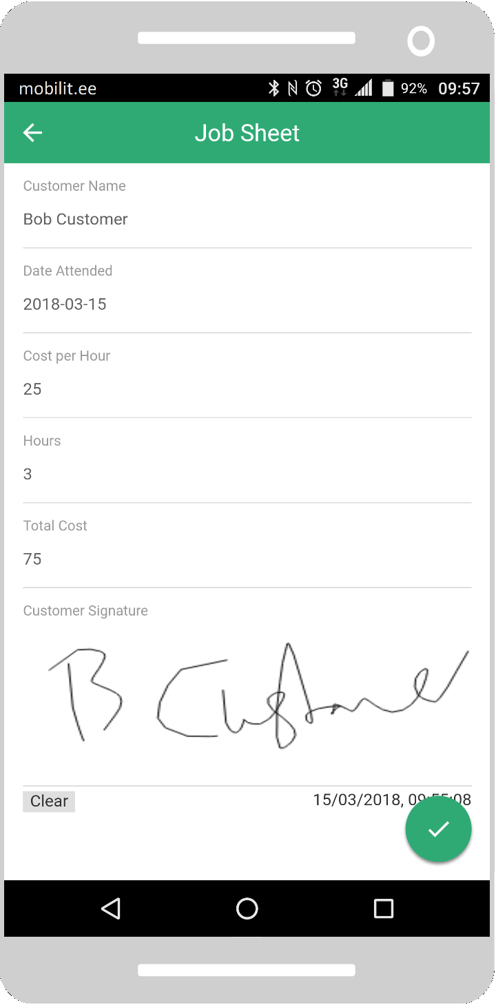
Job Sheet
Name
Date
Cost/hr
Hours
Total
Signature
Build…
- Job Sheet
- AB Customer Name
- Date Attended
- Cost per Hour
- 123 Hours
- Total Cost
- Customer Signature
Publish…
The template
The white area of the screen shows the template design. If it’s a new template, there will be one item, which represents the template itself.
Elements in the template will appear underneath, and slightly indented to show that they are “inside”. This is because the template element is a “container” that can hold other elements.
“Container” elements, like sections and the template itself, can be collapsed or expanded by tapping on the arrow on their left end. Use this to close sections you’re not working on to keep them out of the way. This only affects how things appear in the Builder, not how they appear on the mobile app.
The palette
At the right side of the Builder, you’ll see the palette of all the things you can add to your template. These are the “components”. Learn more about them.
In the palette, each component is shown with its icon and, on a laptop or a tablet in landscape orientation, its name.
To add elements to your template, tap-and-drag a component across and into the design. You might have to hold your finger for just a moment before you start to drag.
As you enter the design, a faint box will appear showing where your new element will drop. You can drag to anywhere in the design, and you can tap-and-drag existing elements to move them later.
Template elements
Tap on the bin icon to delete an element.
Tap on the undo icon to restore the last deleted item.
Tap on the element (not on the bin!) to see and edit its description. Since the template itself is an element too, it can also be edited.
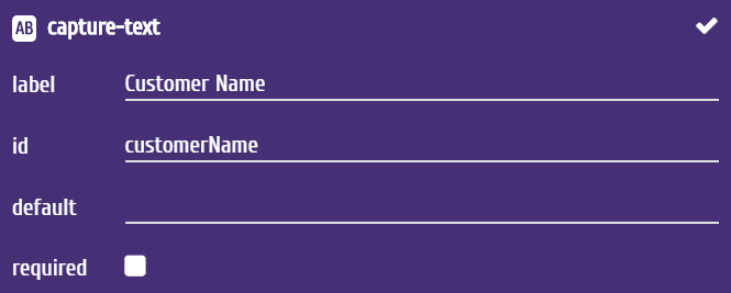
Depending on the type of element, you can edit different aspects of it. Some common ones are:
- label is the text displayed on the mobile device next to the field
- id is used to refer to the data in this element, both in the template, and later when the data is received by, for example, Zapier. IDs are added automatically when you fill in the label, but you must make sure they are unique. You cannot change the template’s ID
- default allows you to specify a pre-filled value for the element – use this when there is one common value and you don’t want users to have to enter it every time
- required – tick this to force users to complete this element; you’ll be able to add a message to appear if they don’t
Tap the tick in the top-right corner to save changes.
Tap anywhere else to cancel. If you saved changes, the element in the design with flash briefly to show it is updating.
Deploying to users
Tap on the arrow in the Templates menu to save and exit.
You’ll see a warning at the top of the page.
New or updated templates must be published before they can be used
And the same symbol next to the name of your new template.
A new template, or any changes to an existing template, will not appear to mobile app users until you “publish” the template. See actions below.
Actions
Tap on the template to see a list of actions.
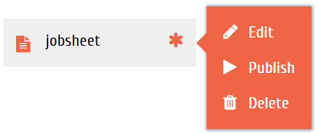
Edit
Open the Template Builder to make changes to this template’s design. Changes won’t be visible to mobile users until they’re published.
Publish
Make a new template, or an updated template, visible to mobile app users. This only appears if the template is new, or if it has been edited since it was last published.
Delete
Deleting a template is permanent. Documents based on this template will not be deleted and will still be processed, but mobile app users will be unable to edit them.
Testing templates
At the top of the template page, there is an option to test your templates.
Test templates
Tap it to open a simulation of the mobile app. The simulation is not fully functional, and you cannot use it to create and send new documents. But you can see new and updated templates there before you publish them.
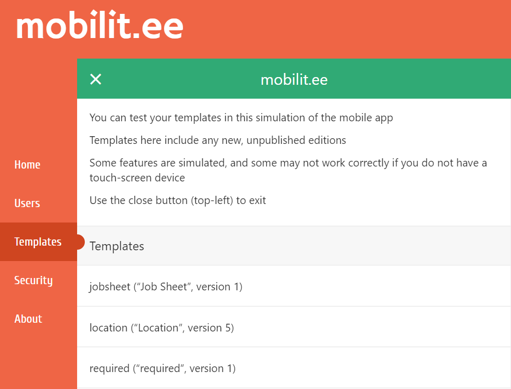
Tap on the cross in the green bar to close the simulation.
Some features, such as barcode scanning, are not functional in the simulation, and you’ll see sample data appear when you try to use them. Since the mobile app is designed for touch screens, if you’re using the simulation on a non-touch screen device, some features might not work correctly.
You will be able to see how your template looks, and test calculations and logic.
Copyright © 2018 mobilit.ee OÜ